
It’s one thing to letter inside a border or frame. But it’s a whole other thing to form your letters into an actual shape. Manipulating letters in this way produces unique looks that are more about the whole design than each individual piece of lettering. When creating distinctively shaped layouts, think of it like a puzzle. The key is finding the right pieces! It’s a challenge, but it’s incredibly exciting when everything fits just right.
The Shape of My Heart
Heart-Shaped Lettering
INSTRUCTIONS:
1. Begin with a sketched heart.

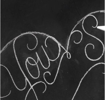
2. Starting in the upper left portion of the heart, draw a “Y” with exaggerated strokes to make up the curve of the heart.

3. Continue with the “Y” descender, dragging it to follow another curve of the heart outline. Add an “o” and “u” to fill the space nicely. The exit stroke of the “u” should hit slightly above the dip in the center of the heart.

4. A key component of a heart is the dip in the center. It’s important to exaggerate it with a drawn element so it stands out. Draw a flourish that outlines this depression.

5. On the other side of the heart, add a large “S” and an “O.”
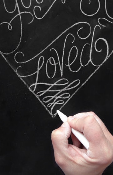
6. Move to the middle of the heart and add a flourish that will contain the word “ARE” above it and the word “Loved” below it. When drawing the “L” in “Loved” connect it to the outline in two places to help give shape to the heart.

7. Extend the exit point of the “L” into a signature flourish that will complete the heart’s bottom point, another key area to emphasize. Once the words belonging on the edges of the heart fit nicely, add the word “ARE” above the center flourish line.
8. Look for any holes in the design. Does the empty spot under the word “So” and the space between the body of the “Y” and its descender look sparse?
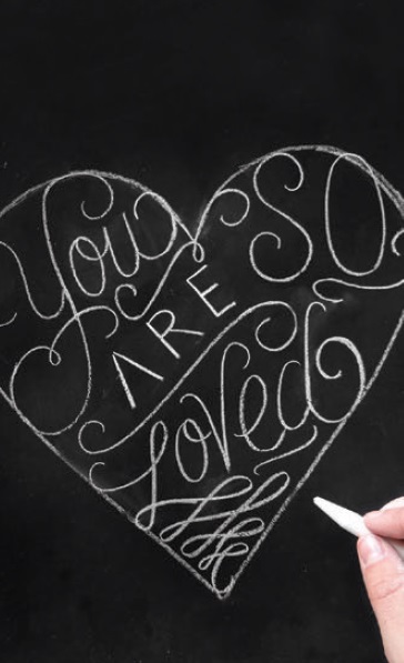
9. Fill in these spaces with little hearts for a cute embellishment.

10. Once your design appears balanced and the outline looks significantly covered, use a cotton swab to erase any of the remaining heart-shaped outline.

11. From the top down, polish the letterforms by thickening the downstrokes and emphasizing the strokes forming the heart.

12. Add any shadow lines and flourishes to fill any holes that pop up.

Excerpted from The Complete Book of Chalk Lettering by Valerie McKeehan (Workman Publishing). Copyright © 2015. Photographs by Lily & Val, LLC.
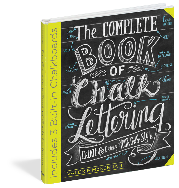
The Complete Book of Chalk Lettering
by Valerie McKeehan
In over 60 lessons, learn the ABCs of lettering (literally) and basic styles: serif, sans serif, and script. Next, how to lay out a design, combine various styles into one cohesive piece, add shadows and dimension. Master more advanced letter styles, from faceted to ribbon to “vintage circus.” Use banners, borders, flourishes.
The book is also a practice space, with three foldout “chalkboards”—the inside cover and foldout back cover are lined with blackboard paper.
GET THE BOOK: Amazon | B&N | IndieBound | Lily & Val


No Comments